📋 Table of Contents
According to a 2024 study by Prezi, 55% of business professionals say a great story captures their focus, but 48% admit to checking their phones during a dry presentation. For a technical product keynote, the stakes are even higher: if your information architecture is cluttered, you don’t just lose attention—you lose credibility.
Most SaaS founders preparing for Dreamforce or local San Francisco summits fall into the trap of the ‘feature dump.’ They treat the big screen like a documentation page rather than a cinematic experience. The result? A high cognitive load that leaves the audience exhausted rather than inspired.
At iStudios Media, we’ve seen how a refined 3-layer visual hierarchy transforms a dense product walkthrough into a compelling narrative. This framework ensures your audience understands the ‘Why,’ sees the ‘How,’ and believes the ‘Outcome’ in under three seconds per slide.
Layer 1: The Emotional Hook and Visual Anchoring
Your first layer must pass the ‘Glance Test,’ communicating the core value proposition before the speaker even finishes their first sentence. Here’s the thing: the brain processes images 60,000 times faster than text, so your headline and hero visual must act as a singular anchor.
- The 3-Second Rule: If a viewer can’t identify the main takeaway in three seconds, the slide is over-engineered.
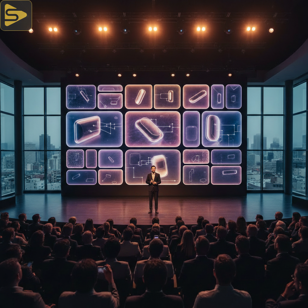
- Bento Grid Design: Borrowing from Apple’s recent WWDC style, use a modular layout to group high-level benefits into digestible blocks.
- High-Contrast Aesthetics: Many technical audiences prefer a ‘Dark Mode’ aesthetic, which reduces eye strain and makes vibrant UI elements pop.
In our experience with Series B SaaS founders, the biggest mistake is using a one-off video shoot or a generic freelance videographer who doesn’t understand the nuance of motion branding. A true technical product keynote requires a production partner who understands that Layer 1 is about feeling, not just seeing. You can explore our video production services to see how we build these visual anchors.
Layer 2: Technical Validation and UI Walkthroughs
Once you’ve hooked the audience emotionally, Layer 2 provides the evidence through high-fidelity UI renders and spatial design principles. This is where you reduce cognitive load by highlighting specific workflows while dimming the secondary ‘noise’ of the software interface.
What most people miss is that you shouldn’t show a raw screen recording. Instead, use 3D product renders or ‘exploded’ UI views that show the depth of your tech stack. This creates a sense of sophistication that sets you apart from a cheap explainer video or a fiverr video production job.
- Spatial UI Principles: Use shadows and Z-axis depth to lift the most important technical feature off the background.
- Dynamic Motion Graphics: Guide the eye with subtle animations—if a data point changes, animate the transition to signify importance.
- F-Pattern Layout: Place critical technical diagrams where the eye naturally scans: top-left to bottom-right.
The real kicker? Technical marketers often struggle with the ‘Signal-to-Noise Ratio.’ By focusing on Layer 2 as a validation layer, you prove the product works without overwhelming the viewer with every single button in your CRM. For complex distribution of these insights, we sometimes utilize Ingest.blog (https://ingest.blog), our internal AI content engine, to help clients turn keynote insights into multi-channel SEO content rapidly.
Layer 3: Social Proof and Micro-copy
The third layer is the ‘safety net’—the micro-copy, logos, and data points that provide the ‘Proof’ and ‘The Action.’ While Layers 1 and 2 are for the eyes, Layer 3 is for the logical mind that needs to justify a purchase or partnership.
But wait—don’t clutter this layer. Use it for visual scannability. A single, high-authority logo or a ’10x performance’ stat in the corner of a slide does more work than a full paragraph of testimonials. In a San Francisco conference video, these details are often what the audience photographs on their phones to share on LinkedIn.
Comparison of Keynote Hierarchy Approaches:
| Element | The ‘Old’ Way | The 3-Layer Framework |
|---|---|---|
| Text Density | Bullet points (15-20 words) | Micro-copy (Under 5 words) |
| Visual Focus | Static Screenshots | Spatial UI / 3D Renders |
| Color Palette | Generic Corporate Blue | High-Contrast / Dark Mode |
Need a partner to execute this level of precision for your next summit? Schedule a free consultation with our production team to discuss your SaaS presentation strategy.
The Psychology of Information Architecture in Keynotes
Visual scannability isn’t just a design choice; it’s a psychological necessity for decision-makers under pressure. When a CMO or VP is watching your technical product keynote, their brain is filtering for relevance. If your slide looks like a spreadsheet, they will tune out.
According to Nielsen Norman Group, users often read in an F-shaped pattern. In a live environment, this pattern is even more pronounced. Your Layer 1 headline should occupy the top horizontal bar, while your Layer 2 technical validation should sit in the center-left ‘hot zone.’
- Visual Anchoring: Use one large element to prevent the eye from wandering.
- Cognitive Ease: High-contrast technical diagrams are dominating SaaS keynotes because they are easier to process in dark conference halls.
- Accessibility: Ensure your 3-layer hierarchy works for color-blind audiences by using varying shapes and line weights, not just color.
Scaling Your Keynote Content Post-Event
A typical Bay Area mid-market client spends $15,000–$50,000 on a premium keynote, yet many let that content die once the lights go down. The real ROI comes from content distribution. Your 3-layer slides are perfectly primed for the LinkedIn ‘Carousel’ era.
Because you’ve already designed with a clear hierarchy, each slide can be exported as a high-performing social post. This is where an integrated partner beats a freelance videographer. We don’t just film the event; we build a system for social media marketing and SEO that lasts for months.
How to repurpose your keynote:
- Turn Layer 1 hooks into LinkedIn video headers.
- Use Layer 2 UI walkthroughs for product demo reels on YouTube.
- Convert Layer 3 social proof into high-converting Google Ads assets.
Ready to move beyond a one-off video shoot? Call us at (510) 838-2005 for a strategic approach to your next production.
Common Pitfalls in SaaS Presentation Strategy
The biggest contrarian insight we offer? Sometimes, the best technical slide is a blank one. If you want the audience to focus entirely on your words, remove the visual competition. Most founders are afraid of the ’empty’ screen, but it’s a powerful tool for visual hierarchy.
Another pitfall is ignoring the mobile-first viewer. Even at a live event, many people are watching the livestream on their phones. If your Layer 3 micro-copy is too small, it becomes invisible. We recommend testing every slide on a 6-inch screen before it ever hits the 60-foot LED wall.
For more on high-end production standards, check out HubSpot’s latest marketing benchmarks to see how video continues to outperform static content in B2B lead generation.
FAQs: Mastering the Technical Product Keynote
How do I balance technical depth without boring non-technical executives?
Use the 3-layer hierarchy to separate the ‘what’ from the ‘how.’ Layer 1 (The Hook) speaks to the executive’s business goals, while Layer 2 (The Validation) provides the technical proof the engineers in the room require. This dual-track approach keeps both audiences engaged simultaneously.
What is the ideal slide duration for a technical product keynote?
Aim for 30 to 60 seconds per slide. If you find yourself staying on one slide for three minutes, you likely have too much ‘noise’ and need to break that Layer 2 technical validation into three separate, digestible slides to maintain momentum.
Should I use live demos or pre-recorded videos in my keynote?
In a high-stakes San Francisco conference video environment, we always recommend high-fidelity pre-recorded ‘simulated’ demos. This allows for perfect visual hierarchy and motion branding that a live, unpredictable software environment simply cannot guarantee. It ensures Layer 2 remains polished and professional.
How can I make my technical diagrams more accessible?
Avoid using color as the only way to distinguish data. Use different line patterns (dotted vs. solid), distinct shapes, and high-contrast labels. This ensures your 3-layer hierarchy remains effective for people with color blindness or those viewing from the back of a large hall.
Building Your Next Masterpiece
Mastering a technical product keynote isn’t about being the loudest person in the room—it’s about being the clearest. By implementing a 3-layer visual hierarchy, you respect your audience’s time and cognitive energy, leading to higher engagement and better post-event conversion.
Don’t leave your brand’s biggest moment to chance or a freelance videographer with a single camera. Partner with a team that integrates production with performance marketing. Contact iStudios Media today for a free consultation on your next keynote or event production.