How do I design my own logo on a budget?
Out of the 60 major car manufacturers that exist in the world, the top 4 most recognizable logos (BMW, Mercedes Benz, Toyota, Hyundai) also happen to be among the most highly-rated car brands. This is no coincidence–brand recognition is a key factor in driving the growth of any business.
A powerful logo design is hands-down one of the most important aspects of brand recognition. It doesn’t matter where you’re from, how old you are, or if you’re even able to read; it would take less than a second for most people to recognize McDonald’s iconic golden arches, or the Apple logo on the back of millions of personal devices.
Many companies are willing to pay hundreds of dollars (up to $500, in some cases) for a logo that, in their eyes, could give their brand the potential to become a household name. While this may be well and good for a corporation with money to burn, what about small businesses and startups who are looking to expand their reach on a budget?
In this blog, we’ll delve into 5 design tips and tricks to help you design your own logo. Although some of these tips might benefit from a background in art or graphic design, this guide was designed to be doable for people of all skill levels who want to learn a bit more about graphic design on a budget.
Brainstorm Logo Design Ideas

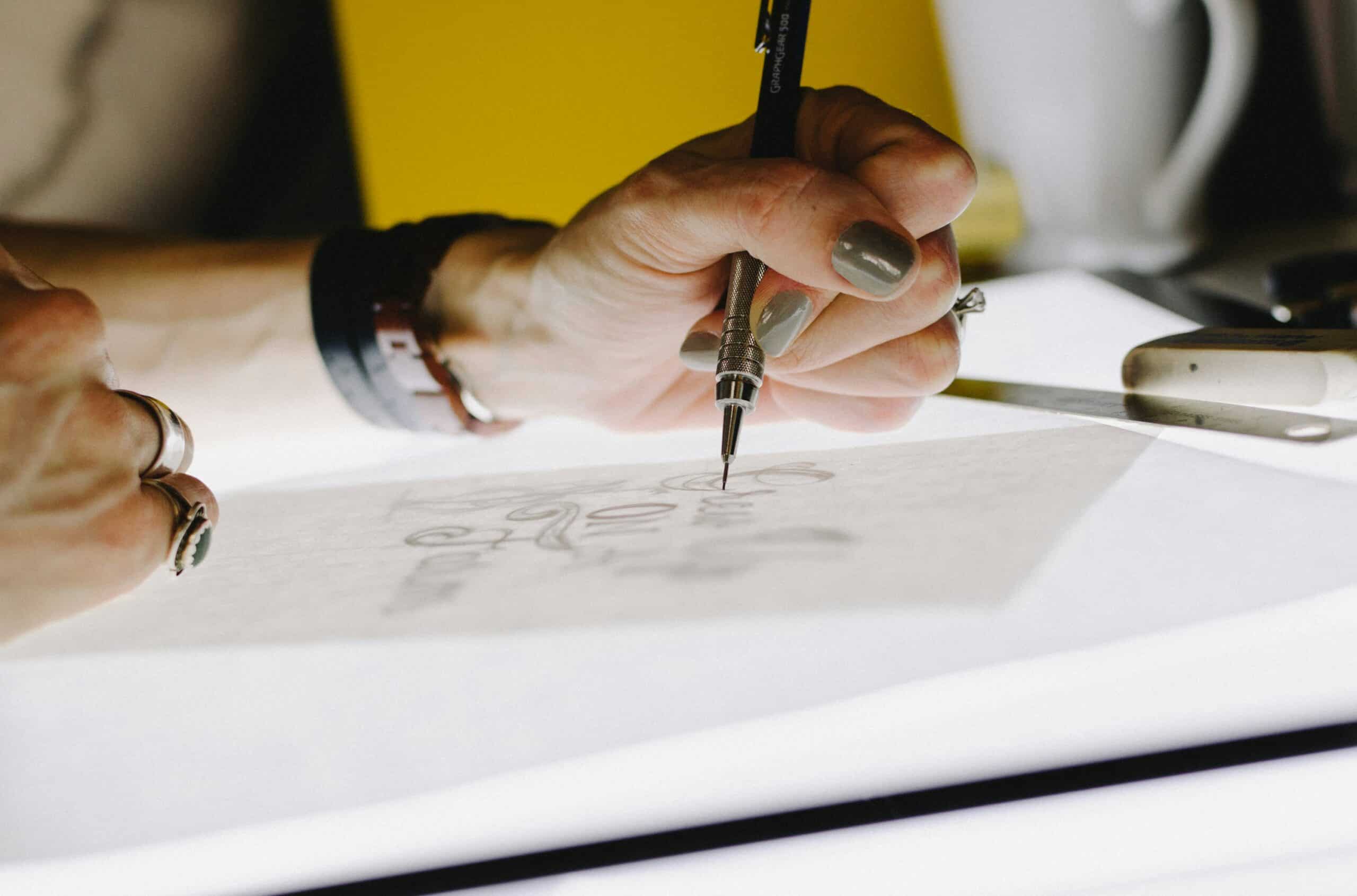
If you’re designing your own logo, it’s a good idea to brainstorm ideas and experiment with your own vision before anything else. Sketching out basic shapes and composition ideas, even if it’s just on a piece of paper, can help you come up with better ideas than trying to get the perfect design on the first try.
If you’re planning on doing your own design work, try investing in digital illustration tools like Procreate, Adobe Illustrator, or Clip Studio Paint. It’s important to note that different tools will have different pricing plans; some charge monthly or yearly subscription payments, while others only charge a one-time purchase fee (the graphic design team at iStudios Media highly recommends Procreate for iOS, which is one of the cheapest options currently on the market).
Learn Basic Color Theory

Before you learn anything else about graphic design, learn the basics of color theory. This is the single most important first step to creating a logo that suits your needs. For logo design purposes, here are the basics you’ll need to know:
- Warm colors (red, orange, yellow, etc.) tend to evoke excitement or hunger, while cool colors (blue, green, violet, etc.) evoke stability and relaxation.
- Neutral colors (brown, black, white, etc.) can work well as a contrast or a background for either warm or cool colors.
- If you’re working with more than one color, using a mix of bright and dark hues can create some much-needed variation in your design.
These are just barely scratching the basics, as color design for marketing is its own topic; further research into color theory on your own time is highly encouraged.
Pick Your Color Palette

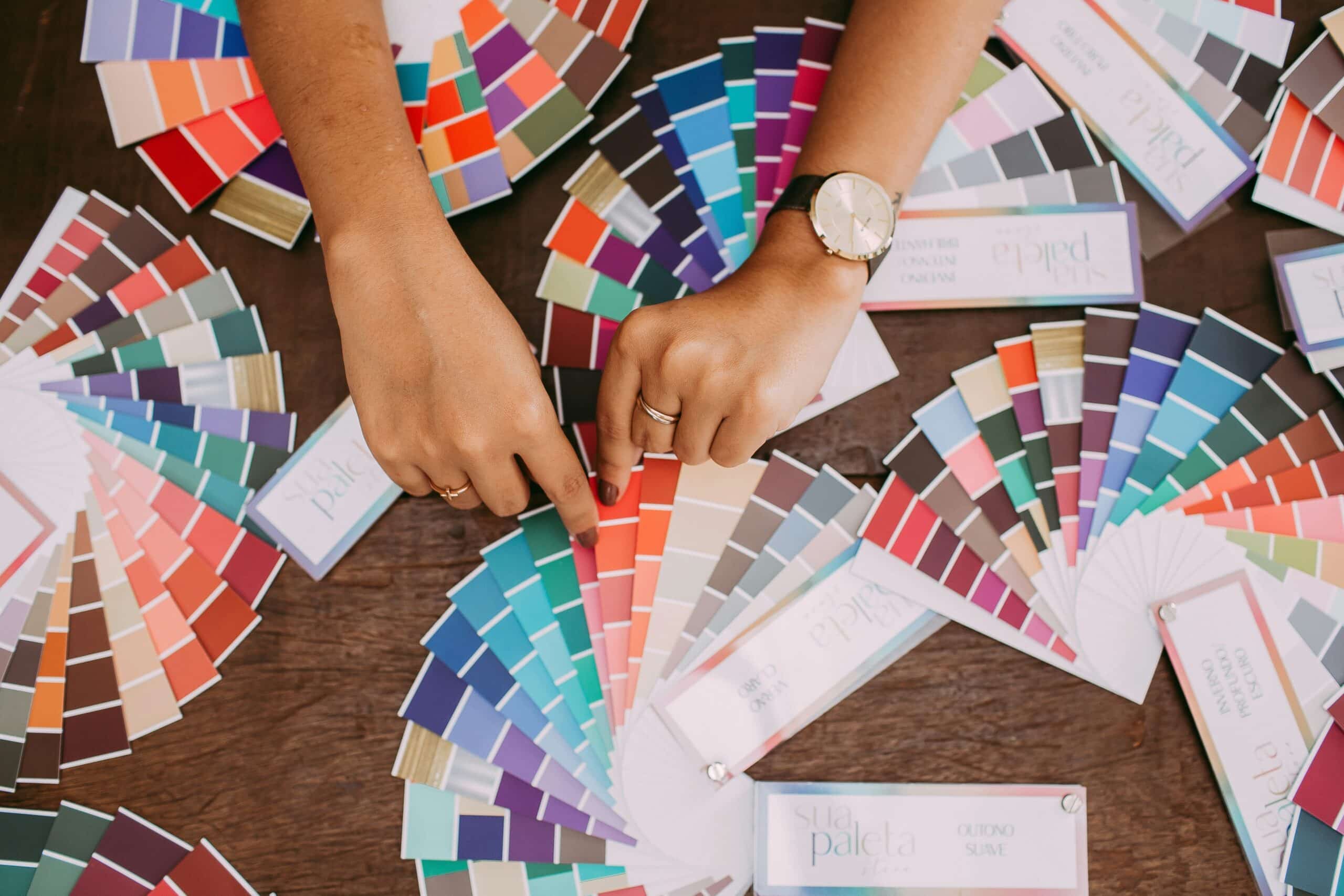
After you’ve taken some time to learn the basics of color theory, you can pick a color palette to represent your brand. Here are a few tips to get you started:
-
- You should use no more than three unique colors (with one dominant color). in your logo to avoid overcrowding your color palette. As of 2023, blue, red, and black are the most common dominant colors in company logos.
- Take advantage of color wheel tools like Adobe Color, which lets you create color themes based on existing harmonies (monochromatic, triadic, etc.).
- Try taking inspiration from existing images with strong color palettes that you might want to use for your brand. Remember: the color dropper tool is your friend!
Use Combination Marks

Though this may seem obvious to seasoned graphic designers, it’s not uncommon for small businesses and beginners to either go all-in on a stylized word-based logo (wordmarks) or an image-based graphic that incorporates text into the design (emblems). However, a 2023 study showed that, out of the 250 most successful businesses in the world, the majority of them used logos that had both imagery and stylized words (combination marks).
Combination marks naturally lend themselves to easy promotion for a couple of reasons. Firstly, keeping the imagery and the words separate allows the brand’s name to tie itself to an image without distracting from either element. Secondly, it allows people to recognize the image and the distinctive text as separate, equally recognizable logos for the same brand; this means more versatile options for branding and merchandise, as you now have multiple options for how to mark your brand while keeping it simple.
Keep It Simple (If You Want)

Corporate minimalism gets a bad rep these days, especially among audiences who value aesthetics over recognition-driven simplicity. That being said, simple logos are a surefire way to make your brand look professional and stick in your customers’ minds. A sleek and simple design–especially one that communicates what your business does– is much easier for people to recognize on the fly, and it allows for subtle, marketable merch designs.
While sleek, minimalist simplicity might be right for businesses who want to maximize their brand recognition and overall reach, it might not be the best fit for everyone. Businesses that want to create a more distinctive, down-to-earth image for themselves might benefit from intricate and aesthetically pleasing designs. No matter which option you choose, your top priority should be creating a design that fits the image you want to create for your brand.
Conclusion
If there’s one thing we should take away from the thousands of ads we see on a daily basis, it’s this: where words fail, recognition shines.
Your logo is how your business introduces itself to passers-by and potential clients alike. This is why it’s so important to create a design that effectively communicates who you are as a brand, as well as what your business has to offer. Don’t let your budget get in the way of having a solid brand; if you’re willing to get your hands dirty with the graphic design process, creating your own logo can be a highly rewarding experience that lets you put a little more of yourself into your brand.


